Everything You Need To Know About The New BlueStacks 4 User Interface

Of the many advantages you get by switching to BlueStacks 4, a key one is the new, modern user interface. This interface has all the practicality and ease of use of the old version. In addition, it offers faster loading times and a more aesthetic look. All of the features you’ve been using are still here, but they have been upgraded further to offer you a more enjoyable gaming experience. First, let’s see what the new interface looks like:
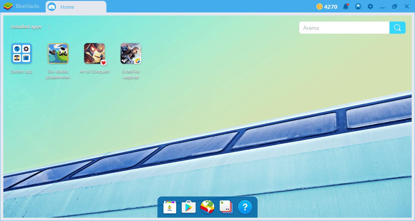
The first thing that attracted your attention was the light blue color, right? You can also get this look with the skin support: The new BlueStacks 4 includes a large number of skins you can add to your account and switch between them. You can change not only the menus and the interface but the wallpaper too. In short, it is much easier to change and personalize the new interface than before.
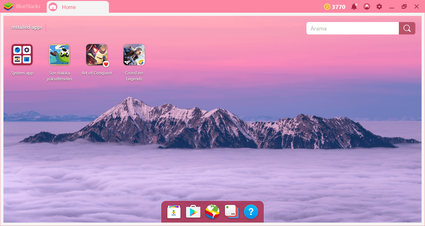
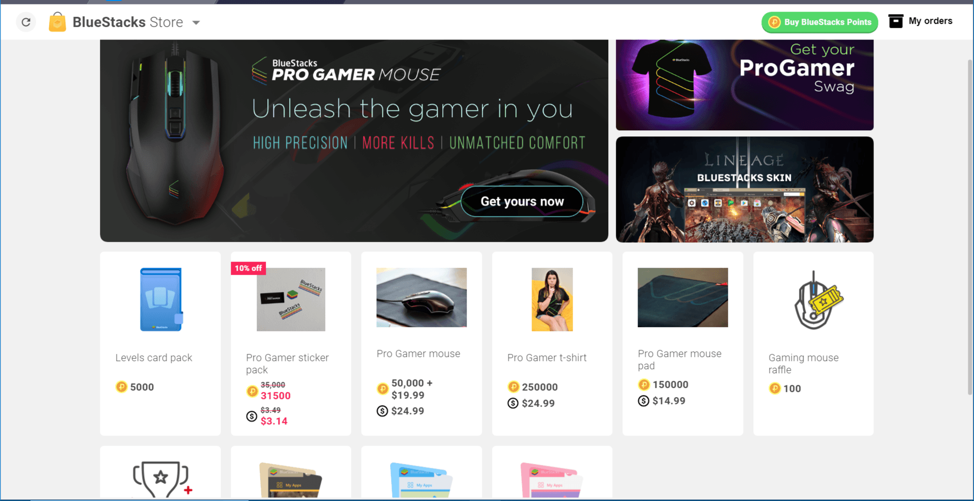
The skin options are not limited to plain colors: You can also get special themes for games too. They can all be accessed through the BlueStacks store and purchased with BlueStacks Points.
Not Just A Pretty Face
But a slick look is not the only thing you get with the new interface: Many QoL (quality of life) improvements are waiting for you. For example, you can now install your favorite apps to BlueStacks with a single click. Just search for the app in the Search Bar at the top Right and get the option to directly install it from the search results with a single click.
It’s also very easy to install an .apk file to BlueStacks 4: Use the “install apk” option in the top left corner, BlueStacks 4 will automatically install your file in mere minutes.
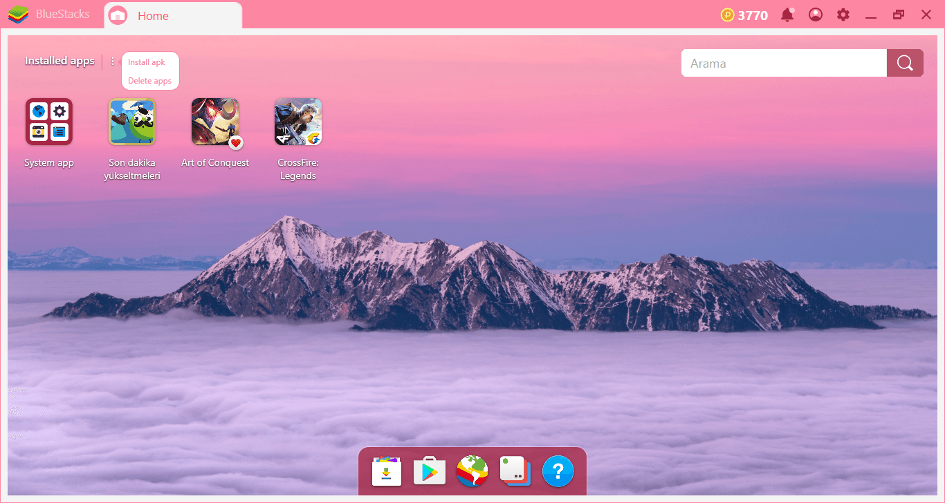
You can easily delete your installed applications using the same menu. In the previous version, you had to long press the left mouse button to do this. This has completely changed: you can remove your apps faster and easier by using the “delete apps” option.
The search box in the upper right corner allows you to quickly access any game you are looking for. You can switch to the “App Center” screen using this option or use the button at the bottom of the screen to do this. You will use this screen frequently to see your collections and top charts, but thanks to the smartly placed shortcut, it won’t cover the interface unnecessarily. The same is true for the instance manager: that allows you to manage multiple instances of BlueStacks. You can access this feature from the button at the bottom of the screen and play games with multiple BlueStacks accounts at the same time. Check the guides we have prepared about this topic to see what benefits you get by doing this.
That’s not all: You’ve probably realized by now that switching between screens is much faster than it used to be. This is due to a large number of code upgrades we made behind the scenes. Transitions between screens are also much smoother now. See it yourself by opening BlueStacks World and your account page: We are using your computer resources more efficiently now to make sure you get the best performance.
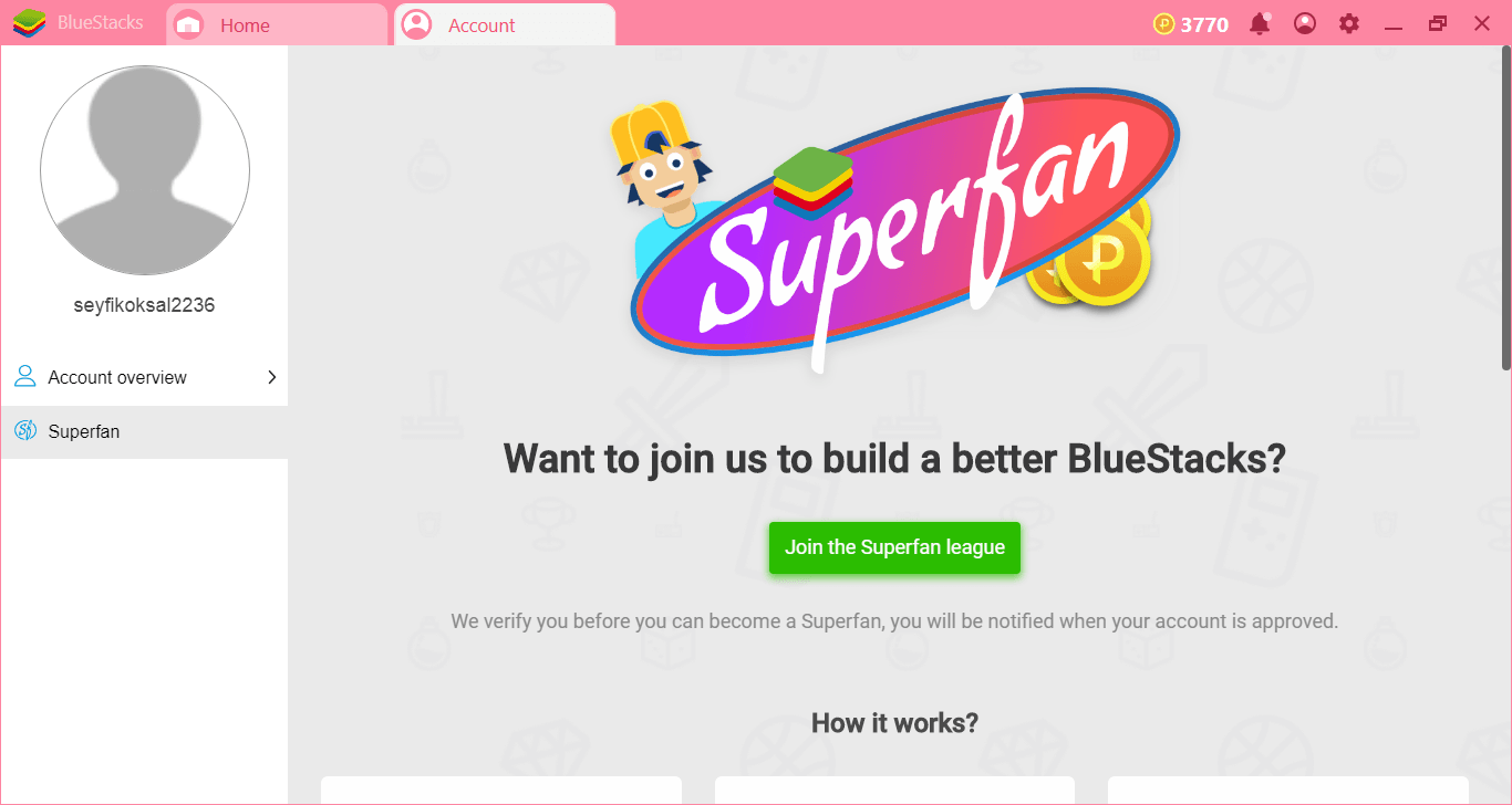
The BlueStacks 4 interface has been redesigned from the ground up so that you can customize it as you like, but it hasn’t lost the spirit: It’s still just as easy and practical to use. We hope that these innovations will add to your gaming experience and make it more satisfying. Read our other articles to learn about the other new features in BlueStacks 4 and let us know what you think of them by leaving a comment.


